Texture and Tone: Using Color and Materials to Anchor an Image
Why texture and tone matter
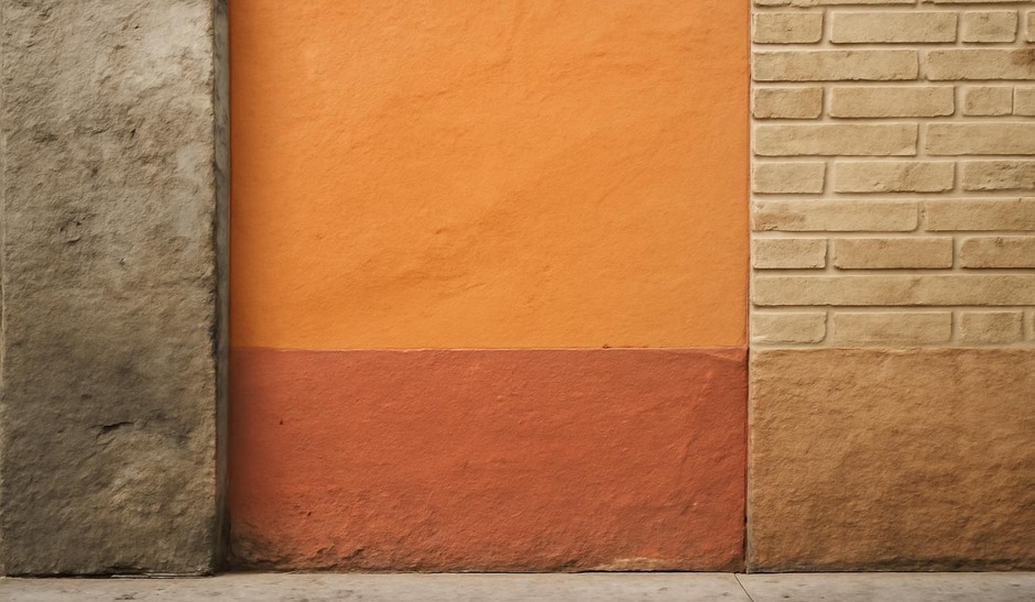
Texture and color are the visual vocabulary of mood. Materials — worn wood, rusted metal, wet pavement, flaking paint — carry tactile information that the camera can translate into tone and mood. Paying attention to these elements helps you make images that feel grounded and coherent.
Material awareness exercise (15–25 minutes)
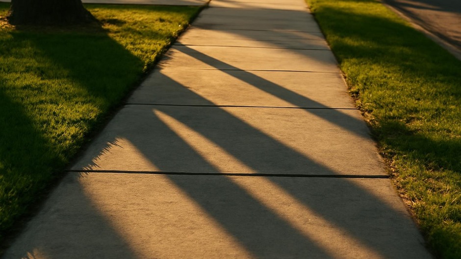
Pick one material type common to your area: concrete, brick, metal, or wood. Spend 15–25 minutes photographing that material in a variety of conditions and contexts. Look for variations in light, wear, and neighboring colors. Your goal is to develop a visual vocabulary of that material and to notice how it changes meaning depending on color and context.
Color pairing drill (10–15 minutes)
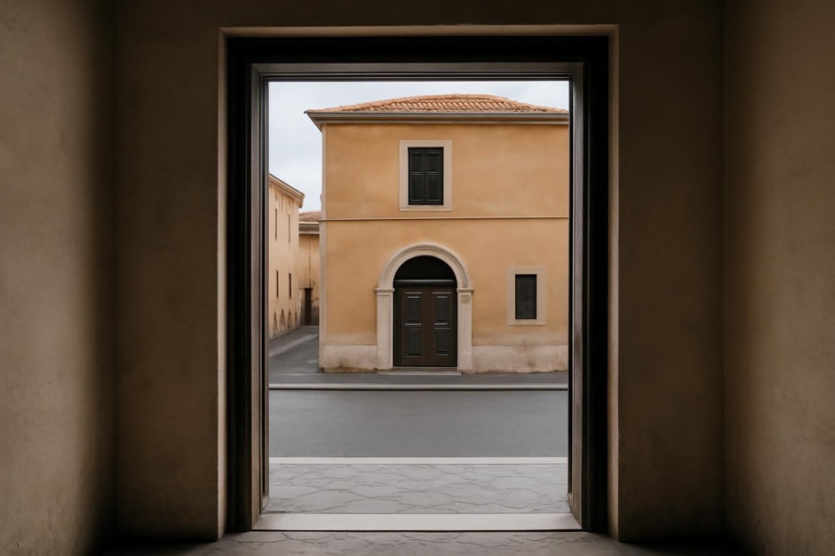
Choose two dominant colors you see in an environment and create a small series that emphasizes their relationship. Try warm/cool pairs, similar hues, and high-contrast pairs. Make images that either harmonize or intentionally clash the colors, then note which pairings are more visually satisfying and why.
Texture layering exercise (20 minutes)
Create frames that include at least three different textures: smooth, rough, and reflective, for example. Use composition to lead the eye through these textures; texture contrast adds depth without relying on dramatic subject matter. This is particularly useful for quiet scenes where surface detail provides interest.
Simple studio test (optional, 20–40 minutes)
If you have a small quiet space, arrange five objects made of different materials and set a single controllable light source. Make a set of images varying angle, distance, and exposure. This controlled practice sharpens your sense of how light interacts with surface and color, which you can transfer to outdoor observation.
Routine to build visual taste
Each week choose a focus: material one week, color the next, and texture layering the following week. Keep a folder of your attempts and re-evaluate after three weeks. You will start to notice preferred pairings and textures that signal a particular mood in your work, helping you make quicker, more deliberate choices in the field.